Flannels Beauty
A sleek, consumer first approach to beauty branding.
-
FLANNELS partnered with SEEN Group to concept, define, and launch FLANNELS Beauty. A new beauty destination that reflects the elevated tone of the FLANNELS brand, while carving out a distinct identity within the beauty space.
From strategy and identity to campaign development and creative rollout, the brand was built around the consumer. Every touchpoint was designed to feel modern, aspirational, and accessible creating a seamless experience across digital, social, and in-store environments. -
This project was delivered by a multidisciplinary team at SEEN Group. As a supporting designer, I contributed to the creation of over 70 custom icons for the FLANNELS Beauty website each designed to communicate key product attributes with clarity and consistency.
In addition to iconography, I supported the rollout of social media and print assets, ensuring alignment with the brand’s new visual direction across multiple formats. -
Agency: SEEN Group
Art Direction & Design Lead: Sam Shaw
Designer: Tania Harisha (Me)
Creative Officer: Liv Sym
Global Strategy Director: Tasha Hulme
Strategist: Megan Luck
Director & Photographer: @vickylawton
Director of Photography: @alexjamin
Steadi: @steadibrooks
Producer: @rosieannwelsh
Production Designer: @lyndonogbourne
1st AD: @missymacltd
Make-up: @nikki_makeup
Stylist: @phoebelettice
Hair: @lukepluckrose
Nails: @tinubellomanicurist
Casting: @_hollycullen
Edit House: @thequarryedit
Editor: @cooperative5 Post
Production House: @candtvstudio
Grade: @simona_colour
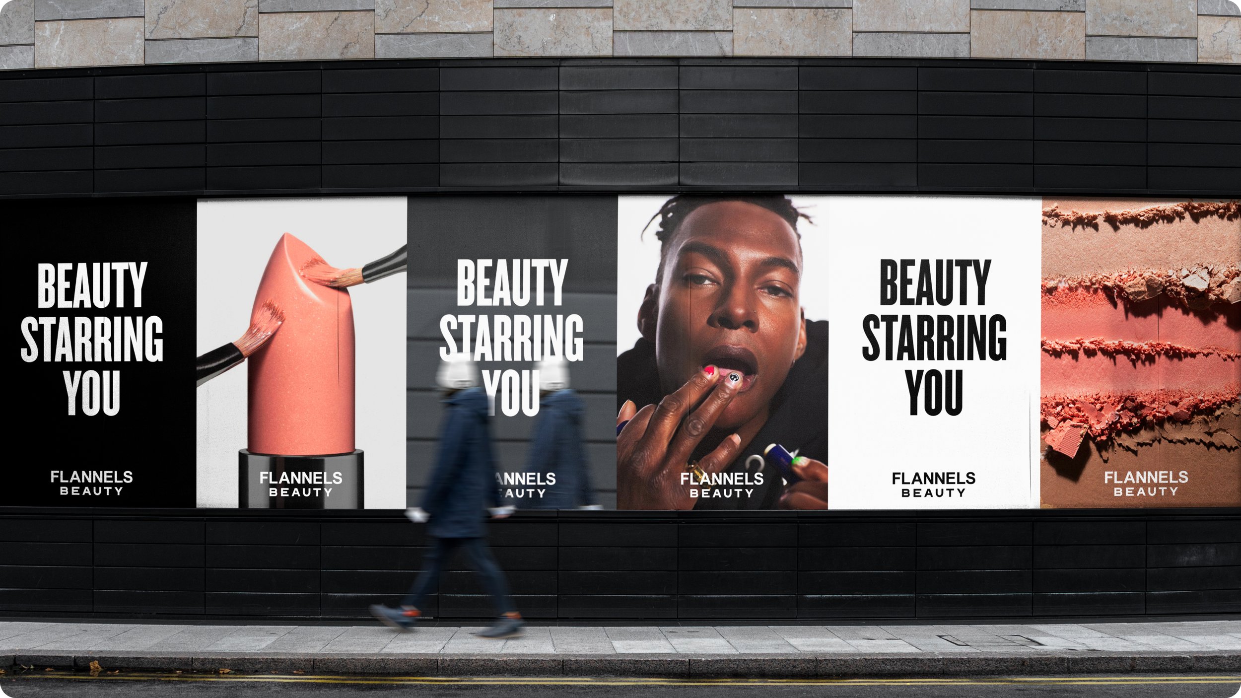
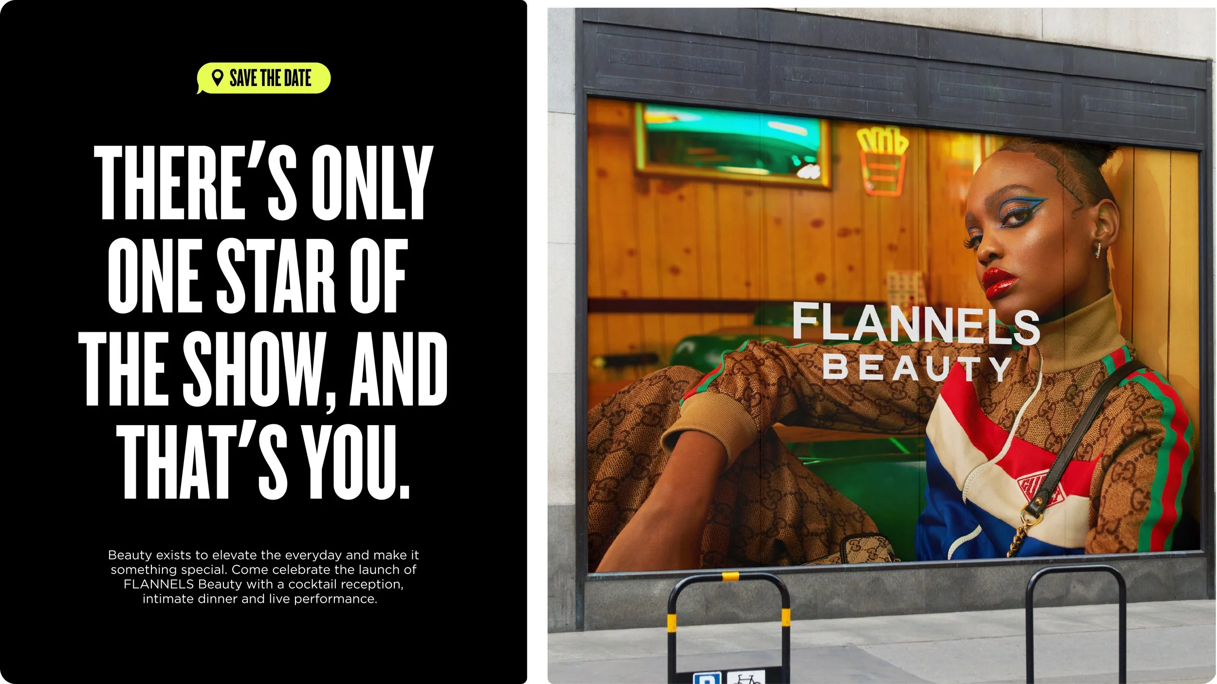
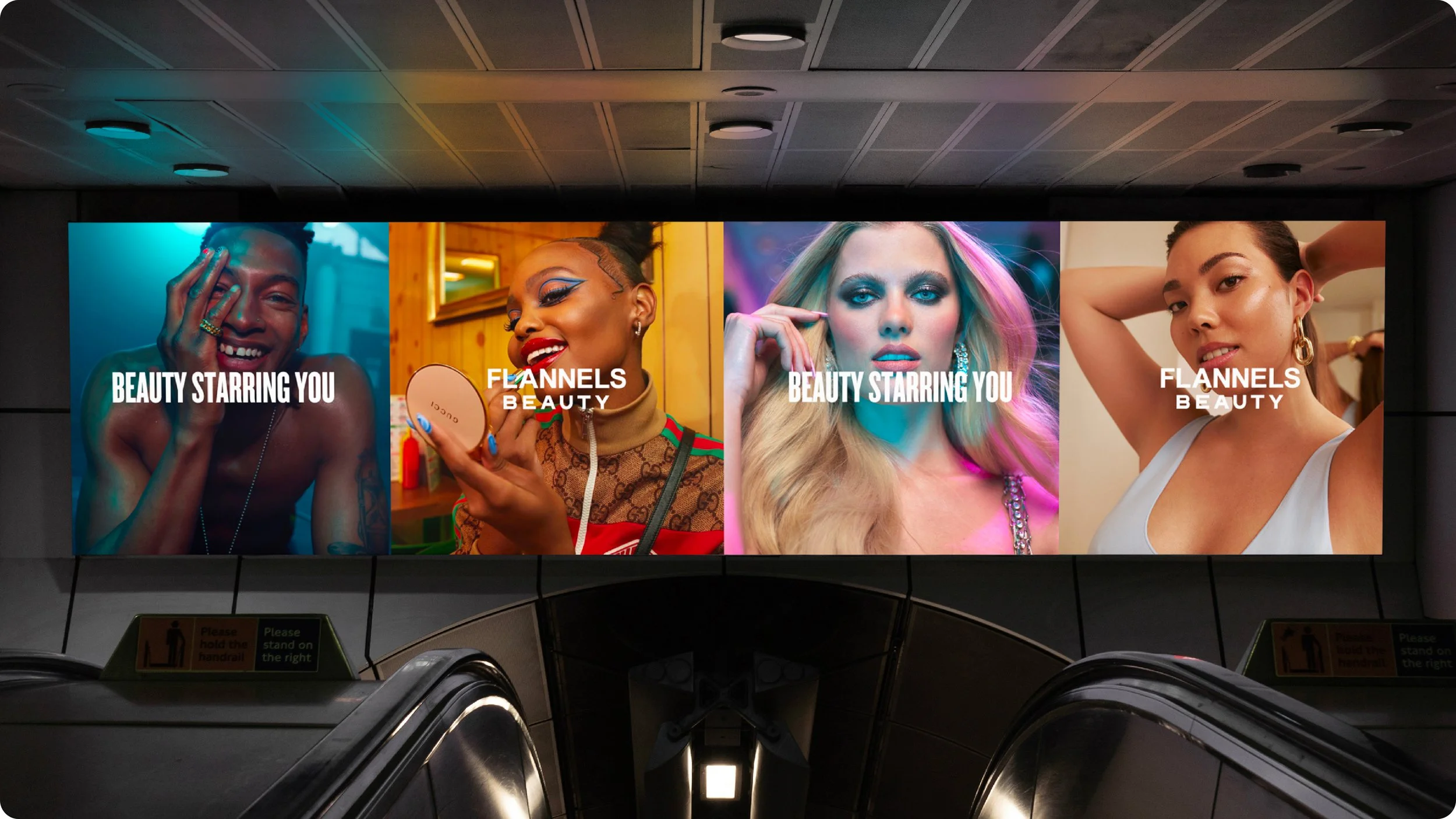
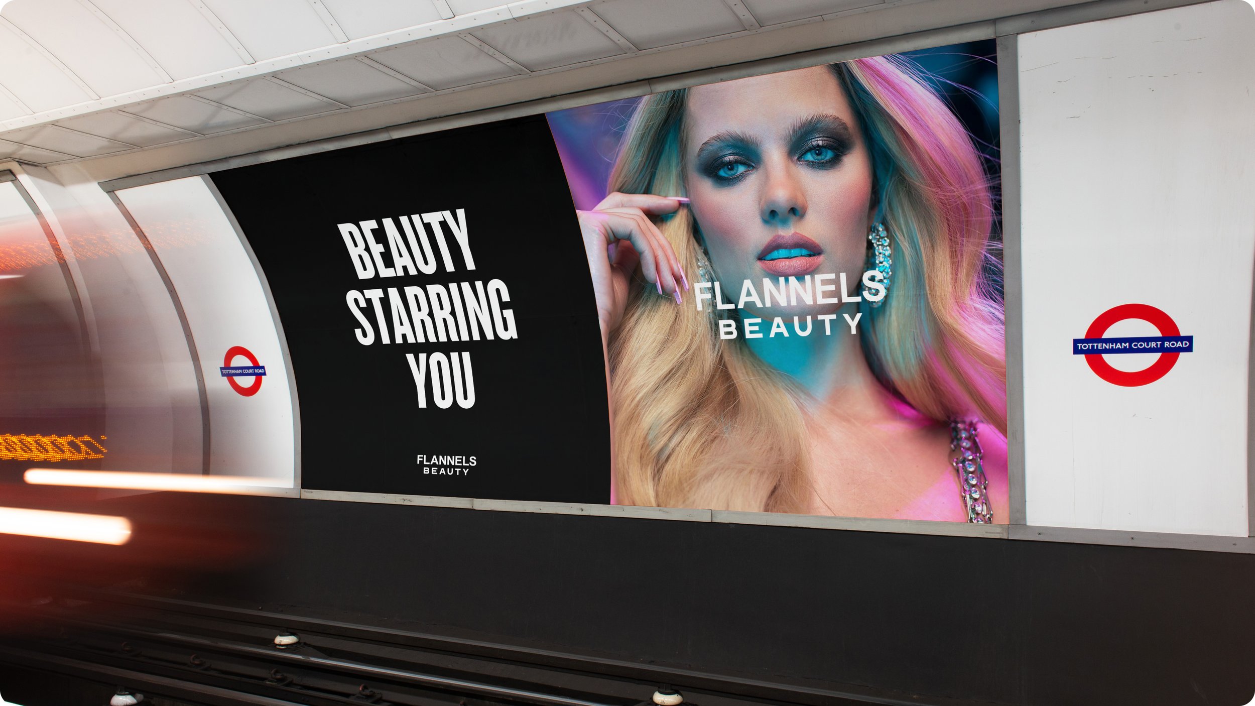
Beauty Starring You.
The customer is the star of the show. This guiding principle became the foundation of the campaign: Beauty Starring You. With five unique consumer profiles developed by the strategists at SEEN Group, the campaign celebrated individuality while reflecting the diverse ways people connect with beauty today. These profiles informed both the messaging and visual world, helping the brand speak authentically to its audience.
A New Visual Language.
As a sub-brand of FLANNELS, FLANNELS Beauty retained the core brand’s sleek, minimalist aesthetic, while introducing a fresh, beauty-forward twist.
The identity centred around expressive typography using Monument Extended, paired with clean layouts and lifestyle photography. The result was a visual system that felt bold yet refined, balancing editorial edge with everyday approachability.
Iconography.
A custom iconography system was developed to support product discoverability across the FLANNELS Beauty website. Over 70 icons were created to communicate key product details, such as fragrance notes, finish, and skin type compatibility.
Each icon was crafted for clarity, consistency, and usability, ensuring a cohesive experience across digital platforms and screen sizes.