MoneySuperMarket
A brand refresh fit for the future of savings.
-
MoneySuperMarket’s site was rich in copy but light on visual assets. They needed a way to guide users to key CTAs, communicate content more clearly, and reinforce their core message: helping customers save money.
We responded by creating a visual system that made saving feel tangible and navigation more intuitive. A bold new colour palette, bespoke 3D coins, textured graphic elements, AI-generated photography, and a distinct look and feel for Agent.i brought clarity, consistency, and brand recognition across web, social, and CRM. Every asset was designed to support content — never distract from it. -
I supported and led areas of this project for over 10 months, which included development of the coins, textures, client workshops, brand guidelines and rollout across platforms.
-
Agency: New Commercial Arts
Client: MoneySuperMarket
Designers: Tania Harisha (Me), Sam Oakes & Maria Marinescu-Duca
Head of Customer Experience: Struan Wood
Account Managers: Olivia Rose & Kirsty Gordon
A simpler logo suite and refreshed colours that signal purpose.
We streamlined the logo suite by retiring the underused double-stack in favour of a single-line mark, making it cleaner, sharper, and better suited for digital environments.
The colour palette focuses on clarity and contrast. Serious Purple houses core content like navigation, CTAs, and reviews, while soft lilacs and white further down the page create a calm, content-focused background that guides users back up to Serious Purple, where they’re encouraged to click through and take action. The result is a clearer hierarchy, smoother flow, and better click-through rates.
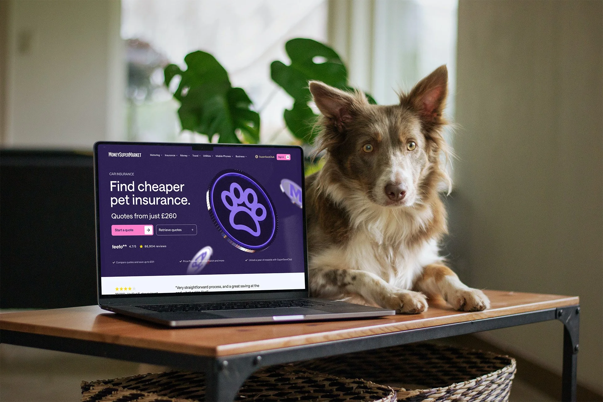
Coins so real you could pocket them.
I designed a set of 3D coins in Spline, each crafted with realistic textures, natural lighting, and subtle colour shifts to echo everyday currency. Every product category, all 17 had its own coin, rendered across 20 angles for flexibility. Used at scale, in sets to build narrative, and across the MoneySuperMarket site, they added movement and visual weight without distracting from the content. We delivered over 600 coins in light, dark, and gold variations.
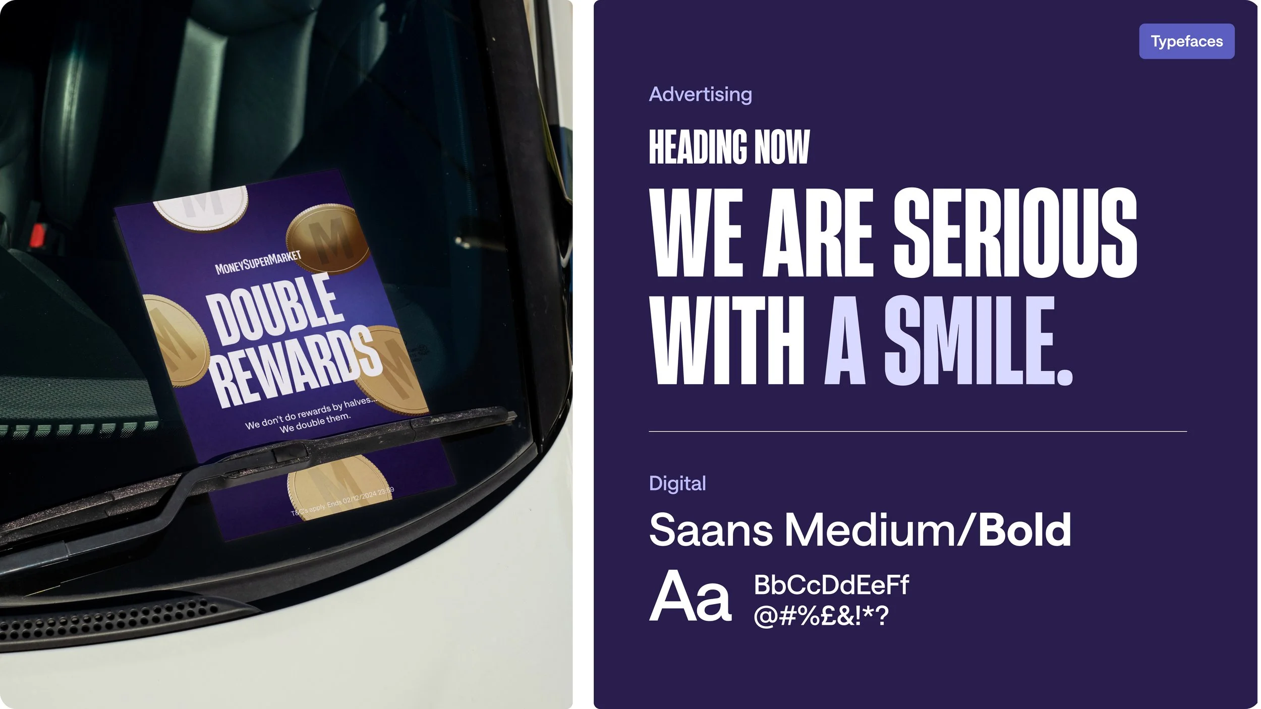
A new digital & advertising typeface and a background in savings.
The textures we’re designed to sit behind copy, mock-ups, or imagery, the textures add depth. Never distracting but subtly reinforcing our purpose. With flexible crops and colourways, they adapt to different spaces while staying true to the brand.
Agent.i: Making advice clear and tangible.
Agent.i is our intelligent on-site assistant, built for 2025 and beyond. It helps customers find what they need faster by guiding them to the right results with minimal effort, making their journey simpler, smarter, and more rewarding. Look and feel created by Sam Oakes.
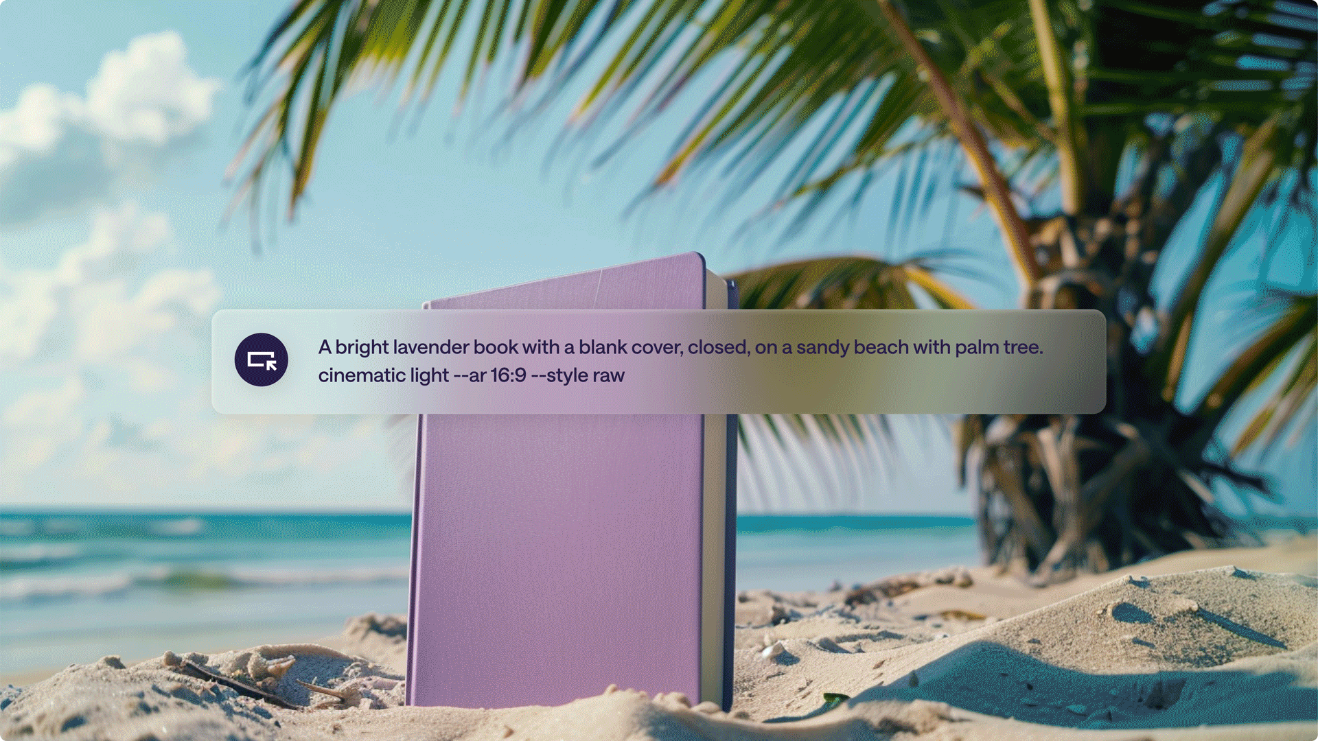
To bring our guides to life, we use AI-generated imagery that presents MoneySuperMarket guidebooks as real objects. These photorealistic visuals feature warm, soft lighting and subtle touches of imagination — designed to add context and intrigue without distracting from the message.

Designed to keep the brand sharp.
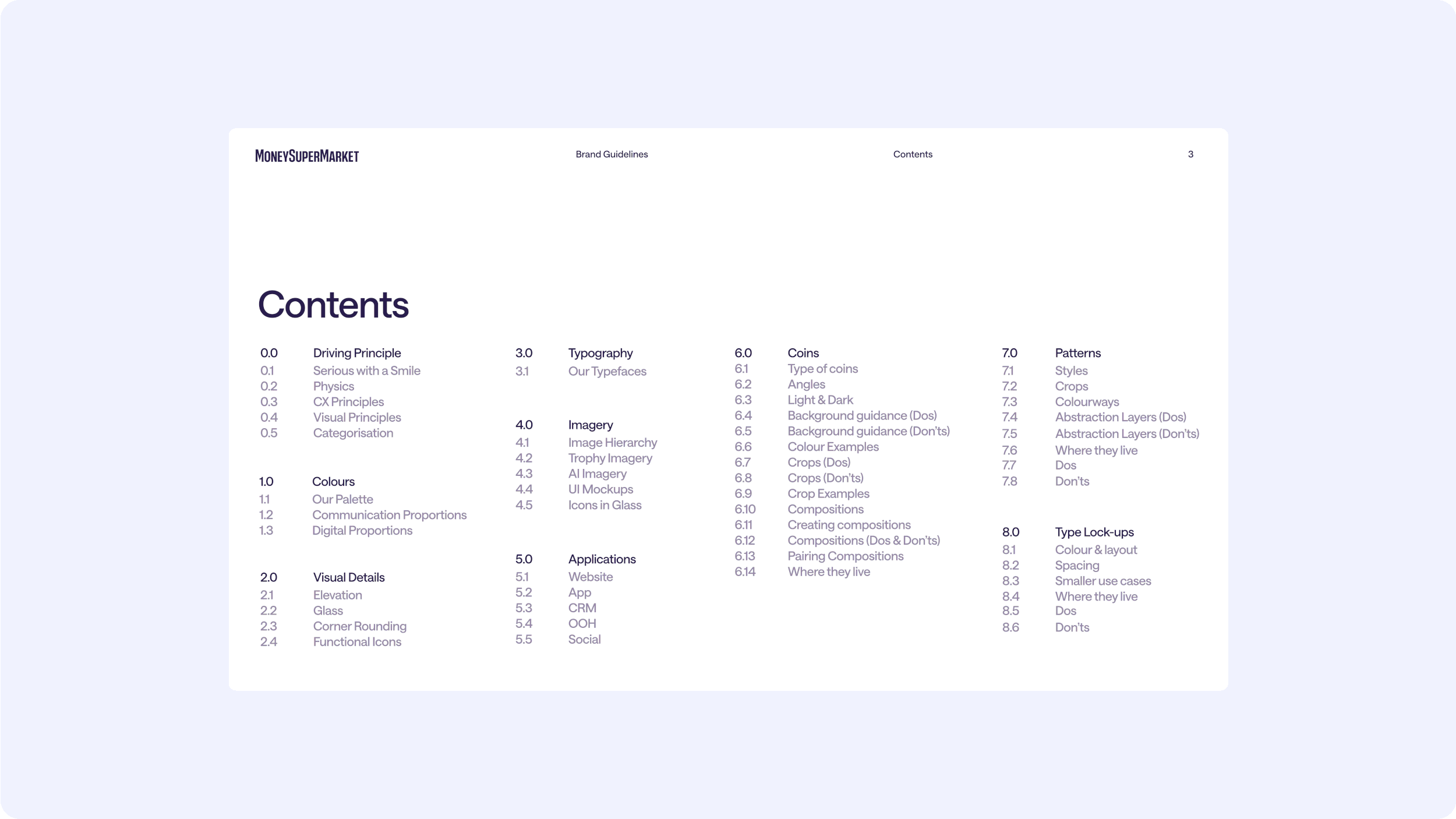
Built for the in-house team and external suppliers, the brand book is the single source of truth. Delivered as a PDF and catered to be hosted online via Zero Height, it’s packed with clear do’s and don’ts to keep the brand consistent and sharp. Designed for easy maintenance, it helps the team own the look and feel, now and into the future.
A special thank you to the team for their dedication and hard work on the asset execution. Their thoughtful guidance and expertise transformed the initial concept into tangible brand assets that perfectly aligns with our core mission of saving money.
It is exactly what I envisioned, adding a new layer of cohesiveness to MoneySuperMarket’s visuals and giving us instantly recognisable assets we've been striving for!
Lisa Taylor
Design Lead at MoneySuperMarket