
The Gym Group
A new energy for a brand built to move.
-
The Gym Group world, was a sea of blue, green, icons and a super G. Their lack of tools meant they were being spread too thinly. We dived deep into their brand to understand their customer’s experience, what works, what didn’t and what was missing.
We refined their look and feel, re- discovering what energy looks like and injected it through heat maps, endorphins, vivid colours, gritty textures and expressive illustrations showcasing movement and vibe at TGG.
-
I worked alongside Tyler from initial research through to delivery. Together, we immersed ourselves in The Gym Group world, defining the customer experience, identifying opportunities, and re-energising the brand.
I was hands-on across every design touchpoint, from research and site visits to crafting textures, typography and more, rebuilding their world with newenergy and capturing the grit, pulse and personality of The Gym Group.
-
Agency: New Commercial Arts
Creative Director: Tyler Hendy
Designers: Tania Harisha (Me)
Strategy: Aidan Panagarry & Matt Walters
Chief Executive Officer: Hannah White Chief Experience Officer: Rob Curran
Illustration: Jack Fletcher
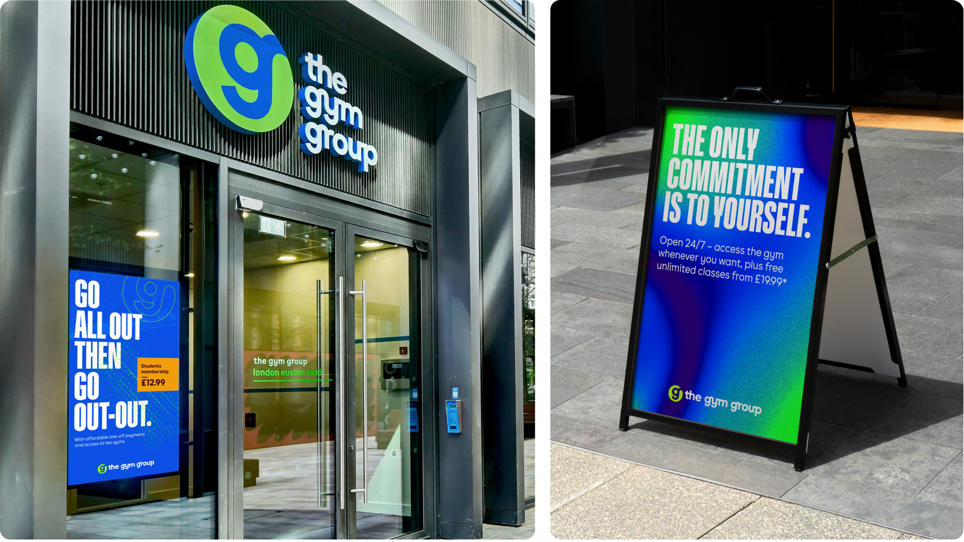
The role of colour – Signals and semiotics.
We visited many Gym Group locations across the UK from Glasgow Scotland to Euston London. What we found was a miscommunication of colours where blue filled spaces from the floor to ceiling. And colours such as red we’re used to promote ultimate membership as well as the emergency help point. We looked to introduce a system where each colour had a role and felt like a new energy. Opting for quality of colour rather than minimal range.
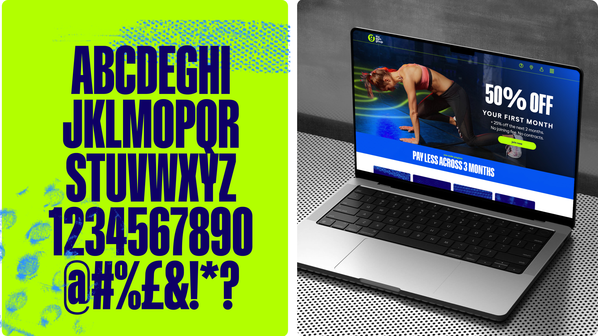
Heavyweight hierarchy.
The original Gym Group Sans was lowercase-only, which made it hard for the in-house team to build energy or establish hierarchy. We added a much heavier third weight and unlocked full caps to give the type more presence. To push it further, we brought in Gravity Compressed X—a bold, condensed sans that brings punch, pace, and the attitude of a sports brand. Now, the system works harder and speaks louder, with tools that empower fast, confident design. You need clear type hierarchy to improve balance, legibility and improve energy by differentiating headings, subheadings, and body text.
Introducing new energies.
Jack Fletcher created the illustrations for TGG, his unique style was perfect for capturing the energy, motion, and community spirit of fitness culture. With exaggerated movement, expressive details, and a focus on elements like gear and sweat, his dynamic approach brings the gym’s personality to life and reflects the power, adrenaline, and high-energy vibe of workouts.

Inspired by research conducted by Florida State University, they discovered what endorphins look like under a microscope we created our own unique pattern that varies depending on heart rate. This asset became a distinctive way to identity personal trainers in the gym. Injecting colour from our endorphin palette 90BPM endorphins are cooler and calmer with tones of blue. Whereas heart rates over 100BPM with a higher intensity start to feel warmer with flourishes of pink and yellows.
Surfaces and textures shape the gym experience, from the cold metal of the weights to the rough chalk on palms and the grip of rubber underfoot. We set out to capture that raw energy, collecting swatches with chalk and paper during site visits across London. Each mark and imprint was then upscaled and woven through exteriors, interiors, digital and print, turning real gym texture into the heartbeat of the brand.

